Search This Blog

De Omnibus Dubitandum - Lux Veritas

Showing posts with label Statistics. Show all posts

Thursday, March 6, 2025

Is Some Honesty About To Come To Government Economic Statistics?

A recurring theme at this blog over the years has been the rank dishonesty of many of our government’s economic statistics. Rather than being neutral indicators of the state of the country and its economy, the most important government statistics have been crafted and manipulated to maximize their usefulness to advocates for increases in the size of government and in government spending. Here is a particularly detailed post on this subject from back in December 2016.

The two main areas of focus here have been the statistics on GDP and on poverty. Both of those come from the Commerce Department.

In the case of GDP, the biggest issue is that government spending on goods and services is counted as a 100-cents-on-the-dollar addition to GDP. That means that the most wasteful spending gives an apparent but false boost to the economy; and even more importantly, that any cut to government spending, no matter how wasteful the spending may have been, gets portrayed as a hit to the economy and a harbinger of recession.

In the case of poverty, the issue is that the official measure of “poverty” counts only cash income, while almost all government “anti-poverty” programs provide in-kind goods and services (think Medicaid, food stamps, public housing, etc.) that don’t get counted. Well over a trillion dollars of annual “anti-poverty” spending thus somehow never reduces the number of people in “poverty” by even a little; and advocates point to a continued high “poverty” rate to demand yet more spending.

For today, I’ll consider the GDP statistics. As Trump 2.0 and the Congress move forward with what will hopefully be large cuts to the most wasteful of government spending, some smart people have figured out that any such cuts will in the first instance get recorded as a shrinkage of GDP. Will this mean we have entered a “recession”? You can be sure that the legacy press will loudly proclaim that proposition. Indeed, get ready for that.

To their credit, some of the top administration people have figured out that this is coming. And thus in the past couple of days you have some of them getting out front on this issue. In a wide-ranging interview on Fox Business on Sunday (March 2), new Commerce Secretary Howard Lutnick said:

“You know that governments historically have messed with G.D.P.,” he said. “They count government spending as part of G.D.P. So I’m going to separate those two and make it transparent.”

(The quote appears in the New York Times at this link.) Lutnick’s statement echoed a similar remark from Elon Musk on his X platform on Friday (February 28):

A more accurate measure of GDP would exclude government spending. Otherwise, you can scale GDP artificially high by spending money on things that don’t make people’s lives better. For example, you could shift everyone who is building cars to working at the DMV. That would result in no cars and a much worse standard of living, but GDP would appear to be the same!

Those two remarks inspired a spirited pre-emptive rebuttal from the New York Times today (March 4). The theme: Trump and his people plan to “interfere” with federal statistics. Excerpt:

Comments from a member of President Trump’s cabinet over the weekend have renewed concerns that the new administration could seek to interfere with federal statistics — especially if they start to show that the economy is slipping into a recession. . . . It wasn’t immediately clear what Mr. Lutnick meant. The basic definition of gross domestic product is widely accepted internationally and has been unchanged for decades. . . . “The implication is that it is OK to manipulate economic data for political gain,” said David Wilcox, a fellow at the Peterson Institute for International Economics and director of U.S. economic research at Bloomberg Economics.

Good try. It’s the now familiar theme that there is something illegitimate about the elected President and his people seeking to run the executive departments of the government. How dare they “interfere” with the completely neutral and non-political efforts of the expert permanent bureaucracy!

The problem, of course, is that the efforts of the permanent bureaucracy are the opposite of neutral and non-political. I’m not sure that the initial decision to include government spending as a 100 cents addition to GDP was dishonest. But once that decision was made, it became catnip to functionaries advocating for bigger budgets for themselves and/or resisting any and all cuts.

As prime examples of wasteful government spending going at 100 cents on the dollar into GDP, consider USAID grants to NGOs funding Hamas and Black Lives Matter protests; or Inflation Reduction Act subsidies to wind turbines. The latter would amount to hundreds of billions of dollars if they go forward, clearly a net negative to the people’s well-being, yet counted at full value as an increase to GDP.

At his Substack called The Honest Broker yesterday, Roger Pielke, Jr., takes issue with Lutnick and argues for continued inclusion of government goods and services spending in GDP:

Remember that GDP is simply a summary of economic activity, not the worth of its components. There are longstanding debates over how to interpret and value government spending, but its inclusion in the top line GDP measure is standard practice — Users of GDP numbers are of course free to redefine the metric however they like.

Pielke correctly points out that the Commerce Department provides detailed GDP reports (here is the latest one for the full year 2024), that break out line items for all the components, including the government spending. Thus, if a user wants to go to the details to see how the economy would have changed without the changes to government spending (on goods and services) it is possible to do that.

The problem is that almost nobody goes to that trouble, most particularly the media that breathlessly report on the latest quarterly GDP statistics. The extent to which GDP changes are an artifact of changes in government spending generally gets completely lost.

What Lutnick could do that would be a real service would be to change the Commerce Department’s communications with the public to emphasize the changes to GDP excluding government spending, and to de-emphasize the changes in government spending and/or the figures that include that spending. It’s the one-page press release that counts. Nobody reads the twenty pages of detailed charts of numbers that follow.

I should note that even if Lutnick accomplishes what I suggest, that would only address a part of the problem. The portion of GDP recorded as federal government spending is only about $1.9 trillion (see page 9 at the link), out of a GDP of $29.2 trillion (page 8 at the link). The federal government spent some $6.75 trillion in fiscal 2024 (which ended on September 30, 2024); and since spending only goes up, it undoubtedly spent even a little more than that in calendar 2024 that ended on December 31. So what happened to the other almost $5 trillion of government spending? Is it somewhere in GDP?

I don’t know the answer completely, but the big pieces are (1) interest on the national debt at about $1.1 trillion (not counted in GDP), and (2) transfer payments (social security, Medicare, Medicaid, food stamps, etc.). These latter items add up to at least $3+ trillion. To avoid double counting, they are not counted in GDP under the federal spending category, but rather are counted as personal expenditures by the people who receive them and spend them. Thus, if some substantial reductions can be achieved in the transfer programs (as for example by identifying and eliminating fraudulent payments to illegal aliens or others), that will turn up as a reduction to GDP under the personal spending categories. Maybe Lutnick has some way to avoid this outcome, but if there is a way, I haven’t learned of it yet.

Meanwhile, next they should get to work on fixing the poverty statistics.

Tuesday, June 11, 2024

The Government is Creating Jobs. Literally.

By Daniel Greenfield @ Sultan Knish Blog

“Today’s report marks a milestone in America’s comeback,” Joe Biden bragged in March. “With today’s report of 303,000 new jobs in March, we have passed the milestone of 15 million jobs created since I took office.” Milestone or a millstone though might be a matter of opinion.

Politicians like to brag about “creating jobs” and for once it was literally true.

Of those 300,000 jobs, 71,000 or 1 in 4 were government jobs. Another 72,000 jobs came out of the healthcare industry which is heavily government funded. And 9,000 came from “employment in social assistance” or welfare. About 1 in 2 of Biden’s jobs were funded by taxpayers in one form or another. The only non-government industry showing significant job growth was the hospitality industry which was prepping temporary employment for vacation season.

An even more absurd story of government job growth came out of New York City where city officials boasted of having recovered all the jobs lost during the pandemic. But a Bloomberg article revealed that “virtually all of the jobs added in the 12 months ended in March were in home health care, a low-paying but rapidly swelling field. It’s technically classified as private employment, but home health care is actually paid for primarily through publicly funded health programs like Medicaid.” Meanwhile actual private sector jobs were vanishing in New York.

“It’s giving us this sense that our economy is growing when in fact it’s really just Medicaid that’s growing,” Bill Hammond, a senior fellow for health policy at the Empire Center for Public Policy, pointed out.

While the Education and Health and the Government job sectors boomed in New York, mostly everything else was contracting or struggling.

And it’s not just New York City.


The Bureau of Labor Statistics report for the nation in April noted 175,000 new jobs of which the majority, 95,000, were in Private Education and Health Services. This was once again the only category that showed any significant growth.

The BLS’s Occupational Outlook Handbook estimated a massive 804,000 increase in Home Health and Personal Care Aides that far outweighed any other job categories. Around 1.4 million of its projected new jobs were in the healthcare arena far outweighing any other group like construction (61,000) or accountants (67,400).

While America’s population is aging, everyone didn’t suddenly get much older and sicker in a matter of a few years, but we have been spending a whole lot more money on healthcare.

One of the disastrous COVID-19 boondoggles was the Families First Coronavirus Response Act which forced states to keep everyone on Medicaid. And as a result, Medicaid enrollment has gone on rising each year by sizable numbers with no definitive decline in enrollment until 2024. The move wiped out all of the Republican congressional reforms during the Obama era and the sharp decline in enrollment under Trump.

The latest New York State budget spends $100 billion on Medicaid. In a state with a population of 19 million, 7.6 million or 40% are on Medicaid.

How did New York City create its massive jobs boom in the “home health industry”?

The answer, discovered by Bloomberg, is that the city began paying family members to take care of Medicaid recipients while treating them as “private sector” workers. The number of people being listed as workers because they provided some care for family members shot up from less than 20,000 in 2016 to 247,538 in 2023. The cost to taxpayers for this program rose to $9 billion and federal funding of New York’s Medicaid program comes out to $66 billion.

The added advantage is that the government was creating jobs without creating any new jobs. It had simply begun paying people for what they were doing already while taking all the credit.

The Biden administration’s Centers for Medicare & Medicaid Services had begun aggressively promoting an expansion in home health care workers last year and it’s paying off. Last year, HHS Secretary Xavier Becerra boasted of having handed out $37 billion from the badly misnamed ‘American Rescue Plan’ for home based services and enhanced Medicaid funding.

Democrat states took advantage of COVID measures and Biden funding to increase their workforces. The home health care workforce more than doubled in Illinois, increased vastly in California, and Wisconsin used pandemic funding to expand its home health care program.

Health care spending and other forms of welfare are a vital part of Biden’s fake jobs boom.

Front Page Investigates (FCI) revealed earlier this year that 10% of new January jobs had come from “employment in social assistance”. The current BLS report shows that “employment in social assistance increased by 31,000 in April” out of a total of 175,000 jobs.

Employment in social assistance has been gaining an average of 22,000 jobs a month.

Along with health care, welfare continues to be the leading source of Biden’s job growth. These are not the signs of a healthy economy, but a faltering socialist economy faking its job growth.

Rather than creating private sector jobs, Biden and the Democrats are creating government funded private sector jobs some of which, like those in New York City, are not even jobs at all.

By boosting Medicaid spending and other forms of welfare assistance, Biden and the Democrats faked a jobs boom and an economic expansion that doesn’t actually exist.


With total Medicaid spending of over $800 billion and overall welfare spending that is too vast to even capture, the Biden administration, along with state and city governments, took us deep into debt to manufacture a recovery without actually doing anything more than padding out the union and welfare rolls that provide them with their voting base.

And it’s not an original idea. Health care employment has risen at a far more dramatic rate than regular employment since the Clinton administration. Health care employment increased 100% since 1990 while other forms of employment have struggled to reach 40%. And where other jobs have not recovered, health care continues to grow. 10% of all jobs are now in the health care sector. And while health care is a necessary service, much of that job increase has been ‘padded out’ by union mandated jobs that don’t actually provide vital and needful services.

The Biden administration’s formula for job gains is government spending. But government spending provides nothing but a temporary boost in the market-based private sector. However creating entitlements and boosting union rolls does create jobs. Unfortunately those jobs tend to be a net loss and a severe drain on the economy. That is what Biden and New York did.

And we’re all paying the price.


Rather than rebuilding a healthy economy, Biden and the Democrats built a health care economy. Instead of creating manufacturing jobs, they manufactured jobs. And so we’re stuck in recession with persistent inflation and the only thing that’s actually booming is the explosive rate of government spending on propping up a fake economy that only benefits the government.


Daniel Greenfield is a Shillman Journalism Fellow at the David Horowitz Freedom Center. This article previously appeared at the Center's Front Page Magazine. Click here to subscribe to my articles. And click here to support my work with a donation.

Wednesday, March 13, 2024

More Misleading Statistics

Critical Thinkers will not be fooled!

One of the most monitored US statistic — and one frequently used for political gain — is the Unemployment Rate. It sounds simple enough (and actually should be) but when bureaucrats and politicians got their hands on it, it’s merely a shadow of itself.

Here is a Mainstream Media article on the most recent Employment Report (just released), plus the Whitehouse spin on it…

Believe it or not (as this superb article explains), there are now SIX different US unemployment rates! Here are the latest (2023) government data for all six. The popularly referred to rates are 3.6% (U-3: unemployed) and 6.9% (U-6: out of work).

However, there is another large fly in the ointment: the unemployment rates (by-and-large) do not count illegal immigrants. When that number was low, it was ignored, as it was considered to be just statistical noise. Since 2020, that is no longer the case, as the current data says some six (6) million new illegal immigrants are in the US, just from the Southern border!

A reasonable estimate is that 4± million of these are people who would be normally considered as part of the labor pool. The approximate size of the US citizen labor pool is 165 million. So the 3.6% (U-3) means that 6± million US citizens are unemployed.

Let’s estimate that 1± million (out of the 4± million employable) of the new illegal aliens are gainfully employed. That leaves 3± million who would be considered unemployed. None of those are considered in the government statistics… Put another way, the U-3 statistic goes from 6 to 9 million (i.e., a 50% increase: 3.6%—> 5.4%). The U-6 statistic would likewise go from 6.9% to 8.7% (i.e., an increase of 1.8%)

The point here is that these immigration corrections are rather sizable, so if the government is claiming to be doing its best to keep citizens accurately informed, (e.g., about our economy) they should include this information in their calculations. Maybe I missed it, but I was unable to find that…

In this vein, I can’t resist plagiarizing this prior Abbott and Costello spoof:

COSTELLO: I want to talk about the unemployment rate in America.
ABBOTT:
Good Subject. It's 3.6%. 

COSTELLO: That many people are out of work? 
ABBOTT:
No, that's 6.9%

COSTELLO: You just said 3.6%. 
ABBOTT: 3.6%
are unemployed. 

COSTELLO: Right, 3.6% out of work. 
ABBOTT:
No, that's 6.9%. 

COSTELLO: Okay, so it's 6.9% unemployed.
ABBOTT:
No, that's 3.6%. 

COSTELLO: WAIT A MINUTE. Is it 3.6% or 6.9%?
ABBOTT: 3.6%
are unemployed. 6.9% are out of work. 

COSTELLO: But if you are out of work, you are unemployed. 
ABBOTT:
No, Biden said you can't count those "Out of Work" as the unemployed. You have to be looking for work to be unemployed. 

COSTELLO: BUT THEY ARE OUT OF WORK!!! 
ABBOTT:
No, you miss his point. 

COSTELLO: What point?
ABBOTT:
Someone who isn’t actively looking for work can't be counted with those who look for work. It wouldn't be fair. 

COSTELLO: It wouldn’t be fair to whom? 
ABBOTT:
The unemployed. 

COSTELLO: But they are ALL out of work. 
ABBOTT:
No, the Unemployed are actively looking for work. Those who are Out of Work gave up looking. If you give up, you are no longer in the ranks of the Unemployed. 

COSTELLO: So if you're off the Unemployment roles that would count as less Unemployment? 
ABBOTT:
Yes, unemployment would go down.

COSTELLO: The unemployment rate goes down because you don't look for work?
ABBOTT:
Obviously. That's how the current administration gets it to 3.6%. Otherwise it would be 6.9%. Our government doesn't want you to read about 6.9% unemployment. 

COSTELLO: Why don’t they include illegal immigrants in the employment data?
ABBOTT:
Because that would make unemployment rates much worse!

COSTELLO: That would be tough on those running for reelection. 
ABBOTT: Duh!

COSTELLO: So that means there are three ways to bring down the unemployment number? 
ABBOTT:
Yes. 

COSTELLO: Unemployment can go down if someone gets a job?
ABBOTT: Correct. 

COSTELLO: And unemployment goes down if citizens stop looking for a job? 
ABBOTT: Bingo.

COSTELLO: And unemployment also goes down if the government doesn’t fully include employment data about illegal immigrants? 
ABBOTT: You’re a genius. 

COSTELLO: So citizens who support the current administration can help bring unemployment down, by stopping to look for work. 
ABBOTT:
Now you're thinking like the Economy Czar. 

COSTELLO: I don't even know what the hell I just said!  ABBOTT: Now you're thinking like some of our current leaders!!!

PS — This relevant article just came out today: Doing statistics can be difficult but understanding them can be fairly simple


Here are other materials by this scientist that you might find interesting:

My Substack Commentaries for 2023 (arranged by topic)

Check out the chronological Archives of my entire Critical Thinking substack.

WiseEnergy.orgdiscusses the Science (or lack thereof) behind our energy options.

C19Science.infocovers the lack of genuine Science behind our COVID-19 policies.

Election-Integrity.infomultiple major reports on the election integrity issue.

Media Balance Newsletter: a free, twice-a-month newsletter that covers what the mainstream media does not do, on issues from COVID to climate, elections to education, renewables to religion, etc. Here are the Newsletter’s 2023 Archives. Please send me an email to get your free copy. When emailing me, please make sure to include your full name and the state where you live. (Of course, you can cancel the Media Balance Newsletter at any time - but why would you?

Leave a comment

Share Critically Thinking About Select Societal Issues

Thanks for reading Critically Thinking About Select Societal Issues! Please pass a link to this article on to other associates who might benefit. They can subscribe for FREE to receive new posts (typically about once a week).

Monday, September 18, 2023

Continuing Manipulation Of Poverty Statistics

September 16, 2023 @ Manhattan Contrarian 

As I have written many times, I don’t think that the federal measure of “poverty” in the United States was originally created with fraudulent intent to deceive the voters. However, as the measure of poverty has evolved over the years, the thing deemed “poverty” by the statistics no longer bears any meaningful resemblance to what normal people think of as poverty. Rather than measuring anything that might resemble actual physical deprivation, the statistics have evolved into an artifact to manipulate the voters. In a post about a year ago I described what I call the “poverty scam” as follows:

[T]he government cynically manipulates the poverty statistics so that the official measured rate of poverty never goes meaningfully down, no matter how much taxpayer money is spent, thus manufacturing a fake basis to hit up the people for ever increasing funding at regular intervals.

Over the past week or so we have just been treated to the umpteenth iteration of this poverty scam.

On September 12 the Census Bureau put out a press release announcing its latest income and poverty data, covering the year 2022. The New York Times covered the release with a big piece the same day: “Poverty Rate Soared in 2022 as Aid Ended and Prices Rose.” From the Times:

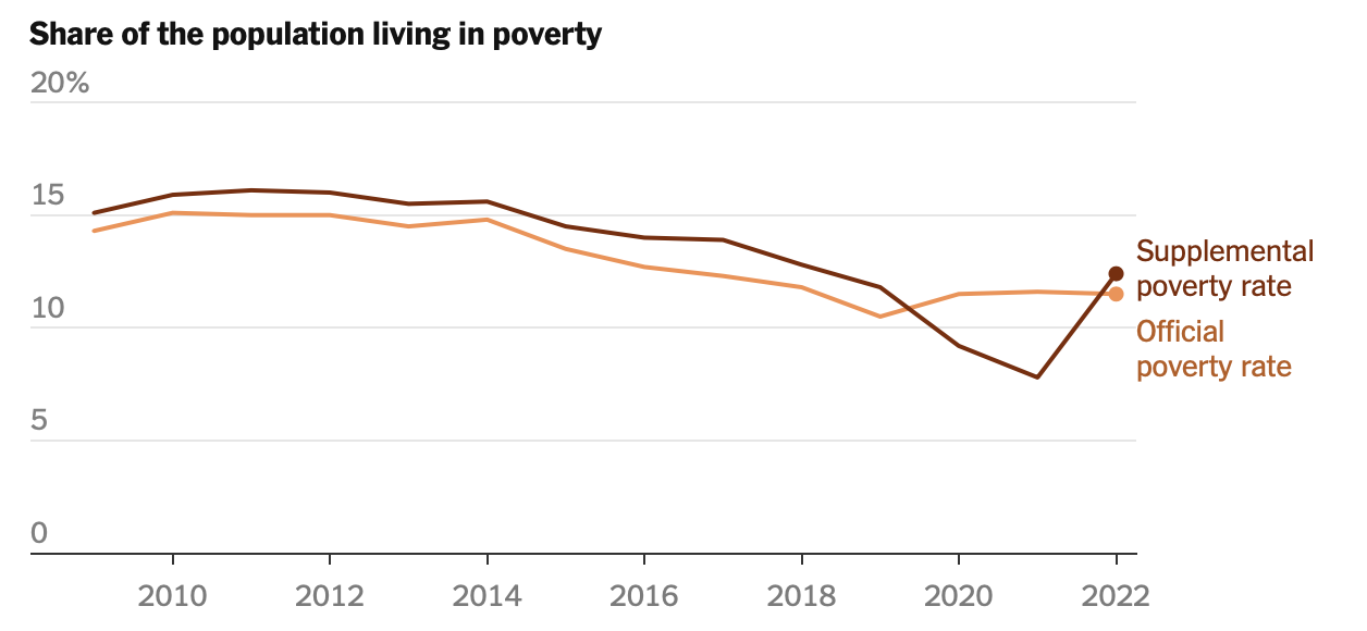
The poverty rate rose to 12.4 percent in 2022 from 7.8 percent in 2021, the largest one-year jump on record, the Census Bureau said Tuesday. Poverty among children more than doubled, to 12.4 percent, from a record low of 5.2 percent the year before. Those figures are according to the Supplemental Poverty Measure. . . .

Now, an increase in the poverty rate from 7.8% to 12.4% in one year sounds like a huge jump — more than 50% in terms of the number of people deemed to be living “in poverty.” How could that have happened in a year which had seemed to be a year of recovery from the pandemic, and with an apparently tight labor market? According to the Times, the key factor was the ending of government aid programs, specifically those related to the Covid pandemic:

[S]afety net programs that were created or expanded during the pandemic. . . included a series of direct payments to households in 2020 and 2021, enhanced unemployment and nutrition benefits, increased rental assistance and an expanded child tax credit, which briefly provided a guaranteed income to families with children. Nearly all of those programs had expired by last year, however. . . .

But the expenditures the Times lists were never intended as anti-poverty measures. What happened to actual anti-poverty spending between 2021 and 2022? As far as I can determine, it did not go down, but rather went up, and not by a little. According to a Cato Institute study here, federal anti-poverty spending in 2021 was approximately $1.1 trillion; and according to a House Budget Committee release here from March 15, 2023, federal spending on its welfare and anti-poverty programs for fiscal 2022 (ending on September 30, 2022) was approximately $1.19 trillion. In other words, there was an increase of close to $100 billion, or over 8%.

So can we get to the bottom of what is going on here? Note that in the Times article they specifically state that the increase in the poverty rate is as measured by something called the “Supplemental Poverty Rate.” That’s the New Coke poverty rate created during the Obama administration to introduce a definition of “poverty” as something no longer absolute, but rather relative to median income, and that therefore would be resistant to ever decreasing no matter how much the incomes of low income people might rise. So what happened in the same year to poverty as measured by the so-called “official” poverty rate (based, supposedly, on an absolute measure of poverty)? Read deeper into the Times piece — like, fifteen paragraphs deeper — and you get this:

The “official” poverty rate — an older measure that is widely considered outdated because it excludes many of the government’s most important anti-poverty programs, among other shortcomings — was nearly flat last year, at 11.5 percent, . . . By that measure, the poverty rate for Black Americans was 17.1 percent, the lowest rate on record.

In other words, this Official Poverty Rate isn’t useful for our purposes in this round, so we will emphasize the other one. A chart accompanying the article shows that the measure of the “official” poverty rate did not budge between 2021 and 2022, despite the large changes in funding including expiration of Covid-related programs and increases in anti-poverty programs:

Now that the Supplemental Poverty Rate has bounced back to be slightly above the Official Poverty Rate, it looks like the natural order of the government poverty statistics has been restored. $1.2 trillion or more of federal anti-poverty spending every year, and the poverty rate, by either measure, just stays right around the same 12% or so. And so the stage is set for the next round of advocacy for increased spending to alleviate poverty, none of which will ever bring the measured rate down meaningfully for any period of time.

Tuesday, January 10, 2023

Should Government Anti-Poverty Programs Promote Independence or Dependence?

January 05, 2023 @ Manhattan Contrarian

Here’s a question where I’ll bet you think the answer ought to be completely obvious: Should the purpose of government “anti-poverty” programs be to help the beneficiaries rise from poverty and become successful and independent, or alternatively should the purpose of such programs be to entice the recipients of aid into a life of permanent dependency upon government handouts? From the earliest days of the anti-poverty programs back in the 1960s, the programs were sold to the public as being a temporary boost by which the poor could be helped to escape from poverty and achieve self-sufficiency. And yet, about six decades in, the rate of poverty never seems to go down, and the number of program beneficiaries grows inexorably. Did something change along the way?

The answer is yes. A new book I’ve just read documents a 180 degree reversal of our government’s policy on the purpose of the anti-poverty programs since the time they began. The book is “The Myth of American Inequality,” by authors Phil Gramm, Robert Ekelund and John Early, published in September 2022. You may recognize Gramm as having been a three-term Senator from Texas (1985-2002). Ekelund is an academic economist, currently at Auburn University, and Early has had a career largely in government statistical offices including the Bureau of Labor Statistics.

Not to overly flatter myself, but this book mostly covers subjects that I have been harping on for a decade or so, accumulated under my tags for Poverty and Income Inequality. However, these guys are much more knowledgeable than I am about the nitty-gritty of how the government statistics on poverty and income inequality are compiled, and I highly recommend their rendition if you want to really understand many of the machinations of our bureaucracy in producing statistics designed to gain support for further growth of the government.

The title of the book — “The Myth of American Inequality” — refers to the statistical legerdemain by which the government statistical bureaucrats (mainly in the Census Bureau and Bureau of Labor Statistics) are able to make poverty and “income inequality” in the U.S. appear far, far greater than they are in reality. From a summary statement in the first chapter, page 4:

The official measure of the poverty rate which uses the Census Bureau definition of income, does not count two-thirds of all transfer payments as income to the recipients. As a result, for more than fifty years, the measured income of low-income Americans has been substantially understated. As we will show, when you count all transfer payments as income to the households that receive the payments, the number of Americans living in poverty in 2017 plummets from 12.3 percent, the official Census number, to only 2.5 percent.

If I have one main criticism of the book, it is that the authors do not forcefully state that the statistics on poverty and income inequality as presented today are fundamentally fraudulent and deceptive, nor do the authors put any blame on anyone for allowing these statistics to become so distorted and misleading over time. It’s like it was just some naturally-occurring process, and things just turned out this way. My own many posts on these subjects do not give that kind of the benefit of the doubt to our self-serving bureaucrats.

The book comes closer to asserting intentional government wrongdoing in describing the inversion of the purpose of the anti-poverty programs from promoting independence to promoting dependence on government. At page 67, the authors quote from President Johnson in his March 16, 1964 address to Congress proposing the War on Poverty:

Johnson’s stated policy objective [was] “to allow them to develop and use their own capacities.”

But then, according to the authors, something big changed, around a time they identify as “the turn of the twenty-first century”:

It appears that both the objective and the method of outreach started to change around the turn of the twenty-first century. Government has not only raised benefits and lowered the eligibility standards, but also started actively to urge people to become more dependent on government. From 2000 through 2016, the US Department of Agriculture (USDA) conducted aggressive recruitment efforts that it claimed boosted food stamp enrollment by 157 percent. USDA spent $40 million annually on advertising to recruit beneficiaries, above and beyond the usual public service announcements concerning the availability of benefits. Seniors and Hispanics were targeted with the dramatized message that they were entitled to the benefits, had paid taxes for them, and should feel guilty because, by refusing to apply for them, they were hurting their families.

And it goes on and on from there. Examples:

  • “USDA . . . trained state and local social service agencies to encourage their public assistance clients to enroll in food stamps.”

  • “One [USDA] training module was titled ‘Overcome the Word “No,”’ which taught techniques for changing the attitudes and values of people preferring not to enroll in food stamps.”

  • “USDA rewarded and publicized state social service agencies for their success in overcoming the ‘mountain pride’ of potential beneficiaries ‘who wished not to rely on others.’”

The authors assert that these kinds of efforts to recruit people into dependency are largely to blame for the substantial disappearance over the last several decades of earned income among people in the bottom quintile of the income distribution, with the former earned income of people in this quintile now replaced with government transfers of various sorts. From pages 67-68:

In the fifty years after the funding for the War on Poverty ramped up in 1967, the bottom quintile’s share of the nation’s earned income fell by more than half. . . . Nevertheless, the standard of living among lower-income households improved substantially from massive government subsidies.

In placing the sea change in the purpose of the anti-poverty programs “after the turn of the twenty-first century,” the authors never attempt to put accountability on any particular administration, or on the bureaucracy or any particular part of it. Was this change brought about by George W. Bush? Or was Obama more responsible? Or was this the bureaucracy following its own internal imperatives with little or no direction or control from the elected leaders? These authors aren’t going to tell us.

My own take is that where we are now is the position that the bureaucratic imperative of growing staff and budget was always heading toward. It would take constant focus and pushback from the elected President and his administration to keep the programs from getting perverted into vehicles for permanent dependency. Obama certainly offered no such pushback, but rather overt encouragement. G.W. Bush may not have given full encouragement, but also never pushed back to the extent he should have.

Anyway, if you buy and read this book, as well as my 100 or so prior posts on these subjects, you will then be among the several dozen people in the country who are on to the statistical scams by which the bureaucracy manipulates the voters into supporting more and more government spending, none of which ever can or will reduce “poverty” or “income inequality” as the government measures them. These few dozen of us will then only need to bring around the tens of millions who have fallen for the scams in order to get some reforms going. Let’s get to it!

Tuesday, September 28, 2021

Denying the Crime Spike

A new report from Third Way downplays concerns about the rising tide of violence.

Charles Fain Lehman September 27, 2021 @ City Journal

A robust debate has broken out over the underlying causes of the surge in violence across the country that began last summer. Was the pandemic to blame, or the riots after George Floyd’s death? That debate has been healthy, but an indefensible position occasionally crops up: partisans who insist, against all evidence, that rising crime is nothing to worry about. That was the view taken by congresswoman Alexandria Ocasio-Cortez, who labeled such concerns “hysteria” this past June. And it’s the view propounded in a new report from the think tank Third Way, whose policy chief, Jim Kessler, similarly suggests that “hysteria” about crime has gripped the nation.

Third Way’s brief has attracted the attention of commentators eager to downplay rising violence. NBC’s writeup on the report has been widely shared. But the report’s claims that the crime wave is made up don’t withstand scrutiny. Even Third Way’s own statistics confirm the surge in violent crime that serious analysts have been warning about.

To reach their conclusions, Third Way analysts Kylie Murdock and Nathan Kasai collected data on the frequency of seven crimes—murder, aggravated assault, rape, robbery, burglary, larceny, and motor-vehicle theft—in 2020 from 22 states and Washington, D.C., and compared them with 2019 rates of the same offenses in the same states. They conclude that crime fell by about 4.9 percent between 2019 and 2020—but this figure is essentially meaningless because it combines all the major categories. In 2019, police reported about 8 million crimes to the FBI, of which the majority (5 million) were larcenies. By comparison, there were about 16,000 homicides. If the overall crime rate is a rough proxy for the larceny rate, then one must examine the numbers by offense type to get a sense of actual trends. Third Way’s analysts do so, finding in the 23 jurisdictions covered that rapes, robberies, burglaries, and larcenies fell—but that aggravated assaults rose 11 percent, automobile theft rose 15 percent, and murder rose a shocking 31 percent.

These results are exactly what anyone following crime statistics since last year would expect: a decline in most property crime (as well as rape, which is infamously difficult to track), and an increase in homicide, assault (a proxy for shootings), and grand theft auto.

Explaining that trend is simple. Most property crimes fell as lockdowns and Covid restrictions sent people home and shuttered businesses, reducing the opportunity for offending. Simultaneously, grand theft auto rose as cars and streets became less attended. Violence, meantime, spiked last summer, a trend likely driven by anti-police protests and ensuing de-policing. Property crime might have risen, too, except that concurrent policy pressures kept opportunities for offending low while funneling trillions of dollars in relief to individuals who might otherwise have turned to theft amid the recession.

Inexplicably, Third Way’s analysts do not consider this explanation. Instead, they reduce any increase in crime to the murder spike, waving away the aggravated-assault increase (and the ample evidence of surging gun violence). Murder may be up 30 percent, they argue, but property crime is down; nothing to see here.

The report makes two other weak arguments. First, it assesses whether Democratic governance had an effect on crime rates, but only by looking at the partisan affiliation of governors. This approach not only results in the amusing classification of Massachusetts as a red state but also ignores the fact that most criminal-justice policy is set at the local level.

Second, having ostensibly dispensed with any role played by last summer’s protests in the violence surge, the authors insist that the problem is likely attributable to some combination of Covid and gun sales. They don’t provide evidence for this thesis; as my colleague Robert VerBruggen has noted, the best available evidence suggests that spiking gun sales were not related to the homicide surge.

Does evidence even matter to Third Way? Rising crime is a political inconvenience to the center-left think tank. Thousands of people were murdered last year. Thousands more were irretrievably wounded, physically and mentally, by the scourge of gun violence. It’s worth debating what caused the problem and how we can address it—but denying that the problem exists, especially under the cover of weak statistics and analysis, isn’t helpful.


Monday, September 27, 2021

The Emperor Has No Clothes: COVID Math Simply Doesn’t Add Up

Eighteen months of COVID-related health data show the numbers promulgated by public health officials and mainstream media vastly overstate the risk of COVID and downplay the risk of vaccines.

From the beginning of the series of events branded as a global health emergency, many people have smelled a rat. Whether one looks at leaders’ willingness to engage in wanton economic destruction, or the rapidity with which billionaires have amassed new wealth or the multisectoral efforts to link and mine people’s intimate data, it is not hard to recognize that something much larger than a health crisis is afoot.

However, even if one restricts oneself to the narrow confines of the health narrative, 18 months of data — emerging in spite of ferocious censorship — have repeatedly illustrated that the official story is full of lies and omissions.  One of the biggest holes in the story is the trail of destruction that the experimental COVID vaccines are leaving in their wake, with hundreds of thousands of reported injuries in the U.S. alone and, according to some statisticians, as many as 150,000 dead Americans. With this level of damage after just nine months, now is as good a time as any to reexamine “COVID math” and highlight some of the embedded falsehoods that cast serious doubt on official and corporate pronouncements about risks and benefits.............Until people hit their seventies, all age groups have survival rates well over 99%:

  • 0-19: 99.9973%
  • 20-29: 99.986%
  • 30-39: 99.969%
  • 40-49: 99.918%
  • 50-59: 99.73%
  • 60-69: 99.41%
  • 70+: 97.6% (non-institutionalized)
  • 70+: 94.5% (institutionalized and non-institutionalized)...............To Read More....


Saturday, May 22, 2021

The Skew in Science That Feeds US EPA Regulation

Stanley YoungS. Stanley Young Warren KindzierskiWarren Kindzierski  – May 20, 2021 @ American Institute for Economic Research


Modern science suffers from an irreproducibility crisis in a wide range of disciplines—from medicine to social psychology. Far too often scientists cannot reproduce claims made in research. John Ioannidis says bias is rife in research and he estimates that a large portion of research findings that physicians rely on – as much as 90 percent – may be flawed and simply false positives

We should be concerned about the current state of Covid-19 science. By the end of December 2020, more than 81,000 publications on the topic existed. How much of this is false and, more importantly, how much of it has been fed into the Centers for Disease Control coronavirus policy?

How skewed science afflicts government regulation can be revealed by looking at how research is used by the Environmental Protection Agency to regulate outdoor air quality. A topic not without major controversy is particulate matter smaller than 2.5 microns (PM2.5). Research done by epidemiologists claims that PM2.5 is harmful to humans in many ways. This has led the EPA to impose onerous regulations with considerable economic impact, mostly based on skewed science.

This skew is evident because the EPA depends on statistical associations between PM2.5 and health outcomes, not on direct causal biological mechanisms. However, the way epidemiologists make statistical associations for PM2.5 and several health outcomes—death, heart attacks and asthma—does not pass independent statistical smell tests. It favors producing false findings that would not reproduce if done properly. Here is part of the problem: epidemiologists conduct large numbers of statistical tests in a study (called multiple testing).

A close look at 70 epidemiology studies making claims that PM2.5 is harmful to humans shows that epidemiologists can often conduct over 13,000 statistical tests in a single study. For any given number of statistical tests performed on the same set of data, 5 percent are expected to yield a false result. A study with 13,000 statistical tests could have as many as 0.05 x 13,000 = 650 false results!

Epidemiologists use advanced statistical software, and they can easily perform this many or more tests in a study. They can cherry pick 10 or 20 of their most interesting (surprising) findings that PM2.5 is harmful. Then can they write up and publish a nice, tight research paper that easily fools editors and peer reviewers—which are mostly false, irreproducible findings. The other possibility is publication bias—editors and peer reviewers give these papers a pass and reject other papers that do not show surprising results to support a paradigm that PM2.5 is harmful.

Mainstream media and the public have not a clue about and appear uninterested in glaring biases in epidemiology research that cause false findings—multiple testing and other forms of analysis manipulation, cherry picking results, selective reporting, and broken peer review.

The process further derails with government involvement. Bureaucrats in government who fund this type of research depend on regulations to support their existence. Over the past 40 years the EPA has slowly imposed increasingly restrictive regulation of PM2.5. However, it is apparent that bureaucrats lack an understanding of, or willfully ignore, skewed science and other biases in research used for PM2.5 regulation. They, along with environmentalists, continuously push for tighter air quality regulation based on false findings.

There is a burden to society that lurks behind the intentions of epidemiologists and government bureaucrats. They collectively skew results towards justifying regulation of PM2.5, while almost always keeping their data sets private. The costs of insufficiently substantiated environmental regulation can become exorbitant. 

A perfect example is estimated costs requiring ships to use “cleaner fuel” with less sulfur to reduce sulfur dioxide emissions. The EPA argued that the move to low-sulfur ship fuel could prevent 14,000 deaths each year by 2020. The inferred health-related benefits are estimated to be more than $104 billion per year in 2020. Yet a growing body of research fails to support the EPA’s argument. This research provides evidence that sulfur dioxide in outdoor air is not associated with death, heart attacks, asthma or lung cancer.

Americans may be paying over $1 trillion per decade to satisfy a regulation with no real scientific foundation or public health benefit! The EPA issues an extraordinary number of regulations, which affect every area of the economy and constrict everyday freedoms. If the long-term cost of one regulation on one industry amounts to $1 trillion, the cost of many regulations on every industry is uncountable trillions.

Extensive regulatory schemes can amount to a competitive advantage for large companies over small ones. Large companies have greater capacity to comply with an extensive regulatory framework. Furthermore, regulatory costs are ultimately borne by American consumers. These costs can have negative health benefits, such as those that follow from increased unemployment.

The practice of epidemiology is largely based on university research. Far too many epidemiologists and government bureaucrats, and a distressingly large amount of the public, believe that university science is superior to industrial science. However, we should treat it with the same skepticism as we would industry research.

Epidemiologists, and government bureaucrats who depend on their work to justify air quality regulation, proceed with too much self-confidence. They have an insufficient sense of the need for awareness of just how much statistics must remain an exercise in measuring uncertainty rather than establishing certainty. This broken process plagues government policy by providing a false level of certainty to a body of research that justifies air quality regulation. 

The burden to society will only worsen with the EPA continuing down the slippery slope of using skewed science. Americans need to be aware that current science being used at the EPA for setting air quality regulation is skewed, obviously expensive and of dubious public health benefit.

S. Stanley Young

Stanley Young

Dr. Young is a Fellow of the American Statistical Association and the American Association for the Advancement of Science. He is an adjunct professor of statistics at North Carolina State University, University of Waterloo, University of British Columbia and Georgia Southern University. He is currently CEO of CGStat in Raleigh, NC.

Stanley worked at Eli Lilly, GlaxoSmithKline and the National Institute of Statistical Sciences (NISS) on applied statistics. He graduated from North Carolina State University, BS, MES and a PhD in Statistics and Genetics. He worked in the pharmaceutical industry on all phases of pre-clinical research. He has authored/co-authored over 80 papers including six “best paper” awards, and a highly cited book, Resampling-Based Multiple Testing.

He is interested in all aspects of applied statistics. His current interest is air quality environmental epidemiology. He conducts research in data mining.

Get notified of new articles from S. Stanley Young and AIER.

Warren Kindzierski

Warren Kindzierski

Warren  is an adjunct professor of environmental health at University of Alberta School of Public Health. He has a PhD in environmental engineering and worked at the University of Alberta Faculty of Engineering and School of Public Health from 1996−2018 and was Head, Chemical Risk Assessment for Alberta Department of Health from 1993−1996.

He has authored/co-authored 60 papers and 43 research reports at the University of Alberta and made over 70 presentations at national and international conferences in North America.

His interests are related to methodologies for better understanding public health impacts/risks of environmental contamination, particularly air quality impacts. Warren has served or acted as an academic expert and/or advisor for public and private sector organizations across Canada on human exposure, human health impact and environmental pollution issues.

Get notified of new articles from Warren Kindzierski and AIER.

Sunday, April 25, 2021

COVID-19 Quick Takes—Part Six

April 26, 2021  By Michael D. Shaw @ HealthNewsDigest

Here we go again with more items on COVID-19 that you may not have seen in the mainstream media. Of course, cancel culture existed in the field of medicine long before that term originated. Some day, someone might just figure out how many lives were lost because of this. Only, don’t hold your breath.

1.     Herd immunity—This term is defined by the Association for Professionals in Infection Control and Epidemiology (APIC) as occurring “…when a high percentage of the community is immune to a disease (through vaccination and/or prior illness), making the spread of this disease from person to person unlikely.” All they venture to say about COVID-19 is:

“A large percentage of the population will need to be immune against the disease (through infection or vaccination) before herd immunity will be achieved. It is not known when that will happen, but it will depend on how many people get vaccinated.” And that’s about as noncommittal as it gets.

Other voices suggest that herd immunity for COVID-19 will never be achieved, and support this contention with five reasons…

  • It’s unclear whether vaccines prevent transmission…..According to mathematical biologist Shweta Bansal, of Georgetown University, “Herd immunity is only relevant if we have a transmission-blocking vaccine. If we don’t, then the only way to get herd immunity in the population is to give everyone the vaccine.” As it is, determining how well these new vaccines block transmission is far from simple.
  • Vaccine roll-out is uneven…..Dr. Bansal notes that previous vaccination efforts suggest that uptake will tend to cluster geographically, and no community is an island. Even countries with high vaccination rates are at the mercy of their neighbors. There is also the matter of kids not being vaccinated, although most believe that kids are not a big source of transmission.
  • New variants change the herd-immunity equation…..This is troubling. Some epidemiologists believe that the longer it takes for everyone to get vaccinated, the more time variants will have to develop. Worse, variants could possibly evolve that might actually thrive in people immunized for the original strain. A case in Brazil indicates that even with a supposedly sufficient rate of infection, the expected herd immunity failed to manifest, and a spike of new infections appeared. As with all epidemiological studies, there are multiple sources of error, but the Brazil experience does not build confidence.
  • Immunity might not last forever…..Bansal says that there is conflicting data on this, and she might be thinking of this study, which showed T cell antibodies to SARS-CoV-2 in blood drawn in 2015.
  • Vaccines might change human behavior…..The specter is raised that people may return to normal behavior before enough community immunity exists. But, this premise begs the question over whether universal lockdowns and other non-pharmaceutical interventions actually work. There is quite a bit of literature extant suggesting that they don’t. And here. Moreover, the atrocious modeling of Imperial College has been put to the test, and has failed miserably.

2.     Do masks do any good?—A review article out of Stanford (replete with 67 references), which should be getting much more publicity, concludes that:

“The data suggest that both medical and non-medical face masks are ineffective to block human-to-human transmission of viral and infectious disease such SARS-CoV-2 and COVID-19, supporting against the usage of face masks.”

Wearing face masks has been demonstrated to have substantial adverse physiological and psychological effects. These include hypoxia, hypercapnia, shortness of breath, increased acidity and toxicity, activation of fear and stress response, rise in stress hormones, immunosuppression, fatigue, headaches, decline in cognitive performance, predisposition for viral and infectious illnesses, chronic stress, anxiety and depression.”

3.     Don’t believe the inflated COVID-19 death toll—In a scrupulously documented piece, Anthony Colpo obliterates the sensational numbers being touted endlessly. Among his key points:

  • CDC admits 95% of COVID-19 victims had multiple comorbidities
  • Fact checkers are demonstrably biased
  • There were multiple ways in which the numbers could be inflated, ranging from peer pressure to ICD codes that allow for all contingencies: U07.1 COVID-19, virus identified; and U07.2 COVID-19, virus not identified. I guess that could explain how a November, 2020 murder-suicide was initially listed as two COVID-19 deaths.

Nothing builds trust as well as flat-out lying, right?


Monday, July 20, 2020

CDC: 0.15% of COVID-19 Deaths in People 24 or Younger; 80.29% in People 65 and Older

By Susan Jones | July 17, 2020

Medical experts have long noted that the younger you are, the less likely you are to contract COVID-19 or suffer adverse symptoms, and the latest numbers posted by the federal Centers for Disease Control and Prevention bear that out.

 CDC's National Center for Health Statistics now reports a total of 188 COVID-involved deaths among people age 24 and younger -- or 0.154 percent of the total 121,374 COVID deaths reported to CDC from early February through the week ending July 11. The majority of students fall into this 24-and-under age group.

By contrast, a total of 97,459 people age 65 and older have died of COVID as of July 11 -- 80.29 percent of the total COVID-involved deaths..........To Read More.......

Thursday, July 16, 2020

Michelle Malkin: Mask Mandates Are a Public Health Menace

By Michelle Malkin | July 15, 2020

Jared Polis, the Democratic governor of Colorado, thinks those of us who oppose scientifically dubious, constitutionally suspect, and dangerously overbroad face mask mandates are "selfish bastards."

I think Polis is a pandering pandemic control freak endangering public health, safety, and sanity.
There. Now that the name-calling is out of the way, let's talk facts.

Contracting COVID can be fatal or debilitating for the elderly, immune-compromised, and physically challenged. But there is no catastrophic public health emergency justifying sweeping government orders and ordinances that would force healthy citizens to wear masks in an increasingly oppressive climate of manufactured fear — completely untethered from pragmatic realities and risk assessments.

There. Now that the name-calling is out of the way, let's talk facts.

Contracting COVID can be fatal or debilitating for the elderly, immune-compromised, and physically challenged. But there is no catastrophic public health emergency justifying sweeping government orders and ordinances that would force healthy citizens to wear masks in an increasingly oppressive climate of manufactured fear — completely untethered from pragmatic realities and risk assessments.

According to the federal government's own COVID-19 data, 120,675 deaths in America have been tied to the virus. Tracked weekly by the U.S. Centers for Disease Control, fatalities peaked on April 18, 2020, with 16,897 succumbing to the disease. (Keep in mind that many medical whistleblowers have reported that these statistics are inflated by including "COVID"-related deaths uncorroborated by lab results and also by including patients who died with COVID infections, but not necessarily from the virus itself.) In the 12 weeks since April 18, as states have reopened and protests (or riots) of all kinds have brought tens of thousands of people in close contact, deaths have fallen precipitously......To Read More.....

Wednesday, May 27, 2020

MSM reporting of US COVID-19 mortality rate: An exercise in 'How to Lie with Statistics'

May 26, 2020 By Carol Brown

A book published 66 years ago and still in print is an essential reference for understanding most of the data that you see about the pandemic afflicting the world today.  Written by Darrell Huff and illustrated by Irving Geis, How to Lie With Statisticsis both sardonic and a serious lesson in the abuse of math for propaganda. Whether or not it was studied by our Trump-hating media anxious to make the U.S. look bad, some of its lessons are being employed.

A few days ago, we learned that the mortality rate from the coronavirus is lower than touted by the "experts."  Much lower.  As in, similar to the season flu.

Now, thanks (again) to Matt Margolis at PJ Media, we see that the United States has a comparatively low mortality rate. But downstate New York has the worst.

Curiously, when the media hounded Trump for weeks about testing, they kept screaming about "per capita" testing rates compared to South Korea. But now you hear not a word about "per capita" rates when it comes to mortality.

Why?

Because the hard numbers make the United States look as though it's fared much worse than the rest of the world. That's because idiots in the mainstream media lack the skill or the will to apply basic math. As Margolis notes, it's quite easy to see that we've done an incredible job.

The first list uses data from May 24 and shows total deaths of the ten hardest-hit countries. As you can see, using raw numbers, the United States appears to have fared the worst as countries are ranked in descending order. 

1.USA (96,046)
 2.UK (36,757)
3.Italy (32,735)
4.Spain (28.678)
5.France (28,218)
6.Brazil (22,013)
7.Belgium (9,280)
8.Germany (8,275)
9.Iran (7,417)
10.Netherlands (5,841)

But when Margolis adjusts the numbers to reflect per capita rates, the death rate per million people changes dramatically, as noted below.  You can see that we drop way down on the list.

1.Belgium (791.76)
2.Spain (573.38)
3.UK (558.95)
4.Italy (524.58)
5.France (415.90)
6.Sweden (391.87)
7.Netherlands (338.01)
8.Ireland (309.86)
9.USA  (288.74)
10.Switzerland (226.80)

Then Margolis does one final calculation. ................To Read More........

Sunday, May 3, 2020

Covid-19 - Cause of Death as a Term of Art

William Walter Kay

Certain government officials and mainstream journalists manipulate Covid-19 death data to magnify the severity of the pandemic. This involves avoiding question-begging geographical comparisons. For instance, how is it that:

Russia with thrice the population of Italy and a 4,200-kilometre, 29-crossing border with China has had 681 Covid-19 fatalities while Italy, at the nether end of Marco Polo’s trek, has had 26,384;

Madrid (population 7 million) has suffered more Covid-19 deaths than Asia’s eight most populous countries combined (population 3.6 billion); and,

The New Jersey-New York-Boston megalopolis has buried two-thirds of America’s Covid-19 fatalities.

Many factors contribute to disparities in regional Covid-19 death tallies; but, the most important relate to guidelines and latitudes given to officials in charge of filling-out Death Certificates (coroners, hospital managers, medico-legal staff etc.). 

Intelligent, informed people can disagree over what should appear in a Death Certificate’s “Cause of Death” box. Disputes over the aptness of Cause of Death descriptions enliven homicide prosecutions and life insurance lawsuits. Cause of Death descriptions are also political footballs booted about by factions within the medical industry who oft complain their pet diseases go underrepresented.

To philosophers “cause” means “selection.” Complex interconnected phenomena pre-exist every event. Distinguishing “background conditions” from “agents of change” is inherently controversial. To proclaim “the” cause of an event is to select one ingredient as the most noteworthy.

The Center for Disease Control’s (CDC) Deaths and Mortality 2017 collates 2.8 million Death Certificates from across America. “Heart Disease” tops the Cause of Death list with 647,457; followed by “Cancer” with 599,108. “Chronic Lower Respiratory Diseases” comes in fourth with 160,201. “Influenza & Pneumonia” held eighth (55,672).

“Pneumonia” refers to bacterial, viral or fungal infections of the lungs. Invasive micro-organisms inflame lung tissue and stimulate mucus secretion. Subsequent constrictions and obstructions give pneumonia-sufferers breathing difficulties and traumatic coughs. Sufferers may suffocate.

Among the thirty pneumonia-causing bacteria we find: streptococcus, staphylococcus, chlamydia and tuberculosis. Before anti-biotics strep featured in 75% of America’s pneumonia deaths (now 10%).

“Influenza” refers to viral infections of the respiratory system. Efforts to corral “influenza viruses” taxonomically are bedevilled in part by swarms of rhinoviruses, respiratory syntactical viruses and coronaviruses inhabiting the same ecological niche as influenza viruses and causing the same “flu-like” symptoms. Influenza viruses alone number over 100. Several are serious human health threats. All mutate into novel strains.

Influenza becomes pneumonia when the viral infection settles widely across the lung. Viral pneumonia tends to be milder than bacterial pneumonia.

Pneumonia patients are often simultaneously beset by multiple pathogens. Patients recovering from viral lung infections frequently succumb to deadly bacterial pneumonia. Nowhere is it standard practice to record all pathogens hosted by such deceased. Estimates are made, however. The H1N1pdm09 virus apparently claimed 12,500 Americans in 2009. “Pneumococcal bacteria” killed 3,600 in 2017.

Official statistics belie pneumonia’s prominent role in death. A follow-up study on 2,287 pneumonia patients found 27% experienced new or worsening heart issues during or after their pneumonia episodes.

If a fatal heart attack occurs during a bout of pneumonia; what caused the death?

A 325-patient, multi-hospital study on cancer treatments informs:
Cancer patients are more likely to get infections. Pneumonia is the most frequent type of infection in this group and a frequent cause of ICU admission and mortality.
If a terminal cancer patient dies during a bout of pneumonia; what caused the death? 

The fourth leading cause of death is chronic lung disease encountering acute lung disease (pneumonia).

The CDC fathomed these depths in April 2020 with their: Guidance for Certifying Death Due to Coronavirus Disease 2019 (COVID-19) which begins:
The purpose of this report is to provide guidance to certifiers of death for cases where confirmed or suspected COVID-19 infection resulted in death.
 The report gives certifiers of death detailed instructions on how to fill-out Parts 1 and 2 of the Cause of Death box in the standardised, CDC-approved Death Certificate.

Popular confusion arises from CDC’s dual use of the phrase “Cause of Death.” In most CDC communiques “Cause of Death” categories are the likes of “heart disease” and “cancer.” On Death Certificates however, such categories cannot be A-listed death causes. They cannot even be “underlying causes.”

Cancer, lung disease etc are buried in Part 2: “significant conditions contributing to death.” These remain the conventional mortality groupings that the CDC, and other health professionals, normally bandy about. Pandemic response protocols, however, require these conventional categories be restrictively discussed. Information about the overwhelming concentration of Covid-19 fatalities among patients with well-chronicled histories of cardio-vascular disease might inspire scepticism about the necessity for the draconian aspects of the pandemic response effort.

The CDC report slow-walks a captive readership through likely scenarios. Regarding Covid-19 deaths the certifier of death shall print neatly, onto Line A of the Cause of Death box’s Part 1, the words:
 “Acute Respiratory Disease Syndrome” (suffocation). The certifier shall then print on Line B of Part 1 (Underlying Causes) either the word “Covid-19” or “Pneumonia.” If “Pneumonia” is printed on Line B then “Covid-19” goes on Line C.
The CDC implores:
If COVID-19 played a role in the death, this condition should be specified in the death certificate.
And:
In cases where a definite diagnosis of COVID-19 cannot be made but is suspected or likely (e.g. the circumstances are compelling and within reasonable degree of certainty) it is acceptable to report COVID-19 on a death certificate as “probable” or “presumed.””
In making this guess certifiers should draw on their “knowledge of current disease states and local trends.” Covid-19’s reputation for lethality increases the number of certifiers of death speculatively listing it on death certificates. Added appearances on death certificates fuels a belief in Covid-19’s extreme lethality.

Fortunately, this is a two-edged sword. As more studies find hordes of a-symptomatic Covid-19 hosts, Covid-19’s reputation as a killer diminishes. Why should the mere presence of a pathogen that kills fewer than 0.1% of its hosts warrant automatic registering on death certificates?

The presumption that the mere presence of Covid-19 establishes Covid-19 as a legitimate, actual “Cause of Death” is erroneous; especially given the scores of common germs known to cause acute respiratory distress and/or pneumonia. Under current protocols a patient could present trace evidence of Covid-19 infection and brazen evidence of strep infection, yet be written-up as a Covid-19 fatality.

To test only for Covid-19, and then to count all subsequent deaths of positive-testing patients as “Covid-19 fatalities” is a bureaucratic pincer movement aimed at jacking-up Covid-19’s body-count. Focussing testing onto terminal wards facilitates this legerdemain.    

Official certifiers of death possess wide discretion in deciding what constitutes a Covid-19 fatality. Certifiers of death are everywhere under the thumb of political parties, each bearing ideologies and agendas. The world’s ruling parties are showing, with the effulgent diversity of an Olympic parade, just how elastic a term of art “Covid-19 death” can be.

Sources: